
Redesign Meu Maná
This case study presents a redesign of the Supermercado Maná app, focusing on improving navigation, usability, and conversion. The updates including a restructured home page, categories, product pages, and cart—aim to streamline the user experience.
The Challenge
The Supermercado Maná app had several areas that could be more efficient in improving the user experience. Some processes were not very intuitive, which made navigation difficult and could negatively impact the shopping experience for users.
The main goal was to make the app easier and more enjoyable to use, from discovering promotions to completing the purchase. The main focus was to improve:
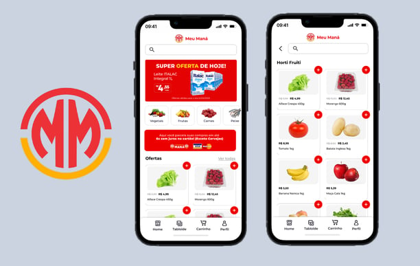
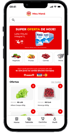
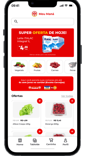
The Home Page: We wanted a more practical homepage that helped users quickly find what they were looking for.
Product Categories: Better organization of products so that users could navigate more intuitively.
Product Page: Ensuring that information was clearly presented to assist in the buying decision.
The Cart: Simplifying the checkout process so that purchases could be completed without friction.
The Solution
This project is a case study where I proposed a redesign focused on simplifying the user experience. The goal was not only to improve the app’s aesthetics but primarily to make it more practical and efficient. The changes I made include:
More Intuitive Home
I restructured the homepage to highlight promotions and the most relevant products. This helps the user find what they're looking for without wasting time.
I added personalized sections based on previous purchases, giving the app a more personal touch and making navigation easier.
Navigation was simplified with a more logical organization of elements, making everything clearer and more accessible.
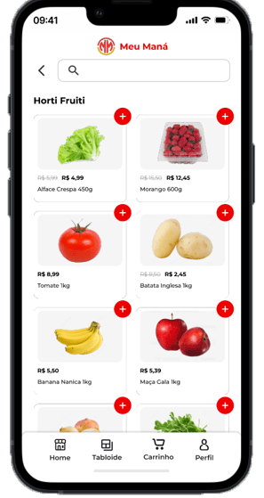
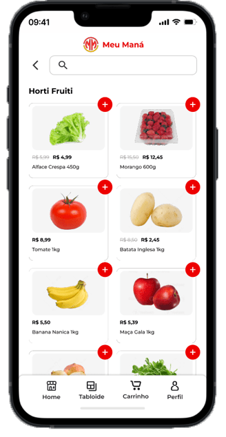
Better Organized Categories
I improved the organization of product categories by using clearer icons and divisions so that users know exactly where to find what they’re looking for.
Filtering and search were enhanced, making it faster to find the desired product.
Clearer and More Objective Product Page
I reorganized the layout to highlight the most important information, such as price, promotions, and reviews, all in a more accessible format.
I adjusted the action buttons to make them more visible, streamlining the navigation process and making it easier for users to proceed to purchase.
Additionally, I added related product suggestions to encourage users to explore more items and potentially add more to their cart.
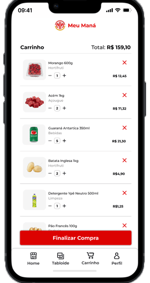
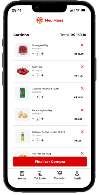
Simpler and More Direct Shopping Cart
I reduced the number of steps in the checkout process, making the purchase completion experience much faster and hassle-free.
I improved the visibility of the purchase summary, giving the user full control over what they are buying and what can be modified.
The "Complete Purchase" button was redesigned to be more prominent, helping the customer finalize their purchase more smoothly.
How I Got There
This redesign was developed with a user-centered approach, and as this is a case study, the proposed solutions have not yet been implemented in the actual app. To arrive at the changes I proposed, I followed a process based on research and testing, which involved the following steps:
Research and Analysis
First, I analyzed the main areas of the app to understand what wasn’t working well. I also studied other apps in the sector to see how they were solving similar issues, looking for best design practices.User Journey Mapping
I mapped out the user journey to identify the points where users felt lost or frustrated. This helped pinpoint the areas that needed the most improvement.Prototyping and Testing
I developed both low-fidelity and high-fidelity prototypes to test the new design with real users. This allowed me to verify whether the changes made sense and were making the app easier to use.Refinement and Adjustments
After testing, I refined the design based on user feedback, making adjustments to further enhance navigation and create a smoother shopping experience.
Conclusion
This case study demonstrates how, with a user-focused approach and strategic design, it is possible to transform the shopping experience in a supermarket app. While the changes haven’t yet been implemented in the actual app, the proposed improvements aim to make the shopping process faster, simpler, and more enjoyable.
The goal of the redesign was to optimize the user experience by making navigation more efficient and the shopping journey more fluid. I believe that if these changes were implemented, the impact would be positive both in terms of user experience and conversion results.